Newsletter pop-ups have a reputation. Done badly, they feel pushy and desperate. Done right, they quietly become one of the biggest growth engines for your email list and revenue.
Depending on who you ask, average pop-up conversion rates range anywhere from 3–11%. That’s a huge gap — and how you design and position your pop-ups is what decides where you land on that scale.
In this guide, you’ll learn:
5 tips for creating eye-catching, useful newsletter pop-ups
Real-world styles and angles you can borrow
How to quickly build and publish pop-ups inside Brandset
Let’s dive in.
5 tips for crafting an eye-catching newsletter pop-up
A pop-up is a visual hook — but design alone isn’t enough. You need something that makes people think: “Yeah, that’s worth giving my email for.”
Here’s how you get there.
1. Offer a real incentive (lead magnet or clear benefit)
People treat their inbox like prime real estate. If you want in, you need to offer more than “sign up for updates”.
That’s where a lead magnet or clear benefit comes in. It might be:
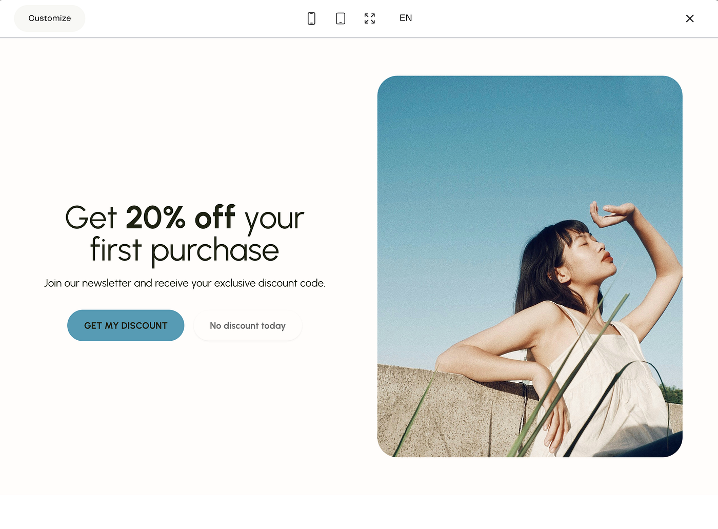
a discount on their first purchase
a quick-start guide, checklist, or mini-playbook
a weekly newsletter with genuinely useful content
early access to drops, events, or sales
a short audit, template, or free trial
Think of it as a value exchange:
They’re giving you their email (and attention).
You’re giving them something that genuinely helps them today.
Examples of simple, strong offers:
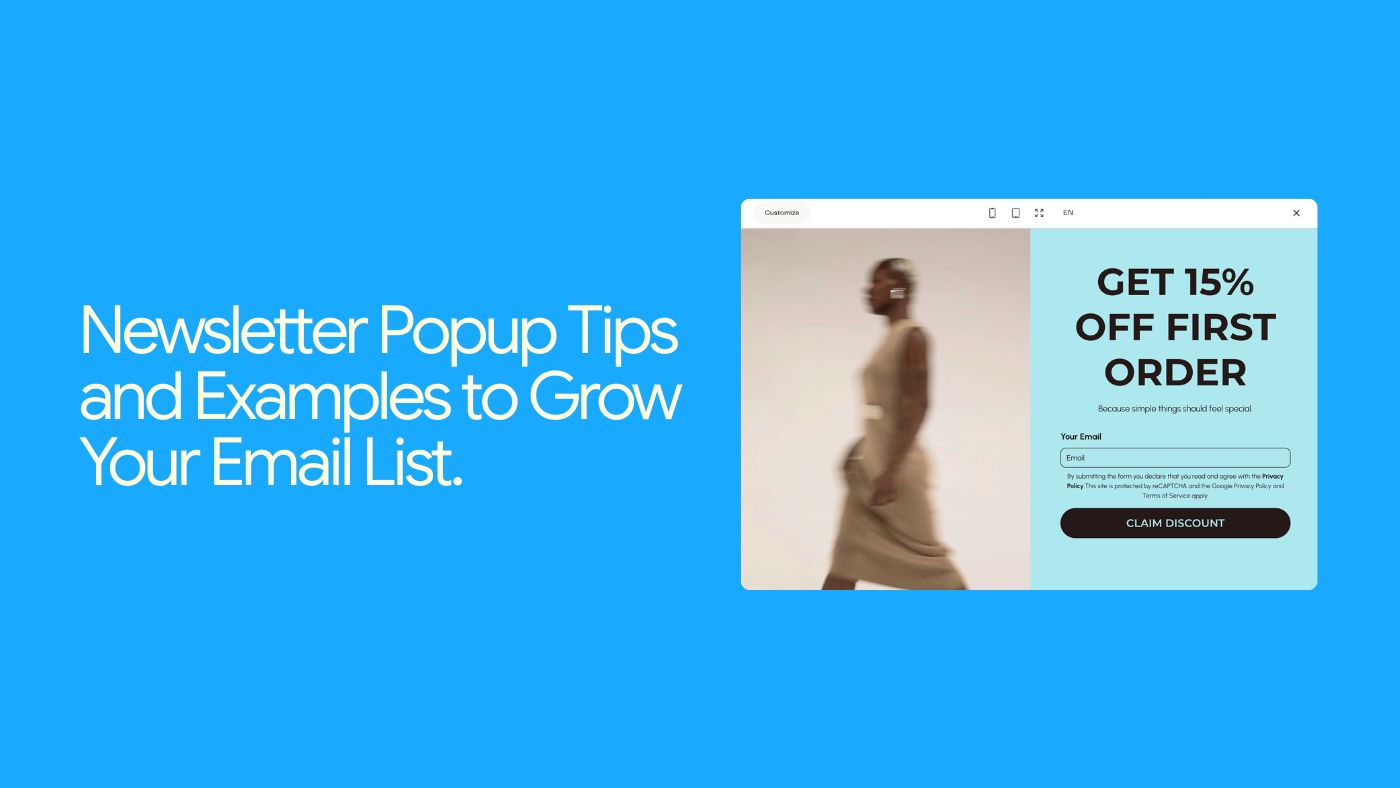
“Get 15% off your first order — plus styling tips in your inbox once a week.”
“Download the Launch Checklist: 12 steps to get your next offer live.”
“Weekly ‘No-Fluff Marketing’ emails: practical ideas you can actually use.”
Inside Brandset, you can tie each pop-up to a specific automation, so:
“15% off” pop-up → discount delivery + simple welcome flow
“Free guide” pop-up → guide delivery + nurture sequence
No extra tools or duct-taped integrations.
Press enter or click to view image in full size
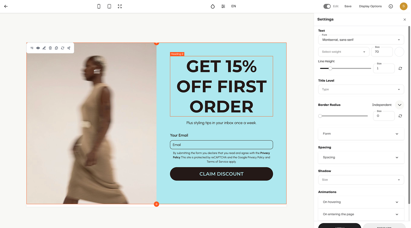
2. Make your value proposition painfully clear
If someone has to read a whole paragraph to understand what they’re signing up for, you’ve already lost them.
Your value proposition should answer two questions at a glance:
What is this?
Why should I care?
Compare:
“Sign up for our newsletter”
vs.
“Get weekly no-fluff marketing tips and templates — straight to your inbox.”
The second one:
names the benefit (tips + templates)
sets a cadence (weekly)
hints at tone (“no-fluff”)
Your pop-up copy doesn’t need to be long. It just needs to be specific.
Structure you can use:
Headline: result + format: “Turn visitors into customers — learn how in our 5-minute weekly email.”
Subheadline: clarify and de-risk: “Actionable ideas, no spam, unsubscribe anytime.”
Press enter or click to view image in full size
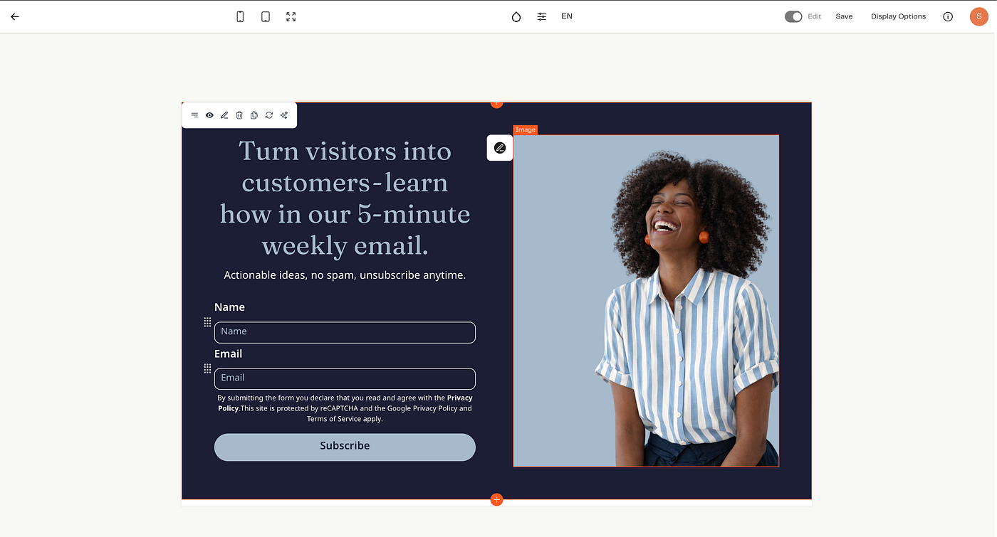
3. Use a striking, relevant image
Visuals are doing a lot of the heavy lifting in a pop-up:
They grab attention.
They signal your brand style.
They quietly tell people who this is for.
Good image choices:
A photo of you if you are the brand (creator, coach, consultant).
A product shot that reflects what they’ll see more of in your emails.
A simple lifestyle image that matches your aesthetic (not generic stock).
The key is relevance:
A stylish, warm photo for a lifestyle brand.
A clean, minimal workspace shot for SaaS or B2B.
A close-up product image for e-commerce.
Inside Brandset, you can:
pull from your Brand Center (logos, colors, imagery), or
upload your own assets, so every form looks like your brand, not a plugin.
Press enter or click to view image in full size
4. Make the CTA button obvious and action-focused
You’re not just designing a box. You’re designing a decision.
Your call to action (CTA) should:
be easy to see
be easy to understand
feel like a natural “yes”
Skip vague CTAs like “Submit”. Instead, use language that matches the promise:
“Get the guide”
“Send me my discount”
"Get my discount"
“Join the newsletter”
“Unlock access”
Keep the surrounding copy simple:
“Weekly recipes, handpicked reads, and cooking tips.
No spam, just good food.
[Sign up]”
Brandset tip: Make sure your button contrasts nicely with the background. High-contrast buttons get more clicks without needing blinking arrows or gimmicks.
Press enter or click to view image in full size
5. Don’t interrupt — time your pop-ups intelligently
Most people don’t want to be hit with a modal the millisecond they land on a page.
You can keep the experience human by choosing when and where pop-ups appear:
Time delay: Show a pop-up after someone’s been on the page for 10–20 seconds.
Scroll depth: Trigger when they’ve scrolled halfway down a blog post.
Exit intent: Only show a pop-up when their cursor moves toward the tab bar or back button.
Page-specific: Use different offers on different pages (e.g., blog = guide; product page = discount).
This way, your pop-up feels like a helpful suggestion, not a door slammed in their face.
5 newsletter pop-up angles you can steal
Let’s turn the theory into concrete patterns you can adapt inside Brandset.
1. Free shipping or first-order perk
When to use it:
E-commerce brands trying to convert first-time visitors into first-time buyers.
Example angle:
“Free shipping on your first order
Join our list for exclusive offers and styling ideas.”
Why it works:
removes a common friction point (shipping cost)
gives them a reason to buy now, not “someday”
also grows your list for future launches
Brandset setup idea:
Pop-up type: entry or timed (10–15s) on product pages
Offer: unique first-order code delivered via email
Automation: simple 3-email welcome + reminder to use the code
2. High-value guide or checklist (“secret tips”)
When to use it: Service businesses, educators, or anyone who can package their expertise.
Example angle:
“Want your brand featured in big-name publications?
Download our guide with 10 ‘insider’ pitching tips.”
Why it works:
the outcome is clear (get featured)
it’s positioned as “inside knowledge”
it sets up your paid offers as the natural next step
You can do the same with:
“Launch roadmap”
“Client onboarding checklist”
“DIY website audit”
Brandset setup idea:
Pop-up on relevant blog posts / portfolio pages
Form submits → automated delivery email + nurture sequence
Tag these subscribers as leadmagnet_pitching (for future targeted campaigns)
3. Subtle, bottom-corner discount box
When to use it: You want to offer a discount without blocking the whole screen.
Example angle:
“Psst… want 10% off?
Join the list for weekly decor inspo + a first-order discount.”
Why it works:
doesn’t interrupt browsing
is always there if/when they’re ready
still gives a compelling incentive
Brandset setup idea:
Use a floating-style pop-up anchored to the bottom corner.
Trigger on time delay or scroll.
Keep the design minimal so it doesn’t fight with your main layout.
4. Timed “welcome gift” pop-up
When to use it: For brands that want to feel more relational than transactional.
Example angle:
“A little welcome gift 🎁
Join the community and get:
— our mini starter guide
— monthly behind-the-scenes notes
— 15% off your first purchase.”
Why it works:
frames it as hospitality, not a “trap”
combines content + discount (more perceived value)
sets clear expectations about what they’ll receive
Brandset setup idea:
Timed pop-up on home and about pages
Use a warm, human photo or illustration
Automation sends a “Welcome inside” email that feels like a personal note, not just a coupon.
5. Full-screen “clear value” modal
When to use it: For big campaigns, launches, or when your offer is strong enough to justify taking over the screen.
Example angle:
“Get 15% off your first order over $60
Plus, early access to new drops and baking tips in your inbox.”
Why it works:
the offer is specific and transparent
they know exactly what they need to do (and spend)
the visual can be big and bold (e.g., hero product shot)
Brandset setup idea:
Use a full-screen pop-up on landing pages tied to a specific campaign.
Make the exit / “X” clearly visible — forcing people to hunt for the close button just annoys them and kills trust.
Turn this off after the campaign ends and reuse it for future promos by simply swapping the copy and discount logic.
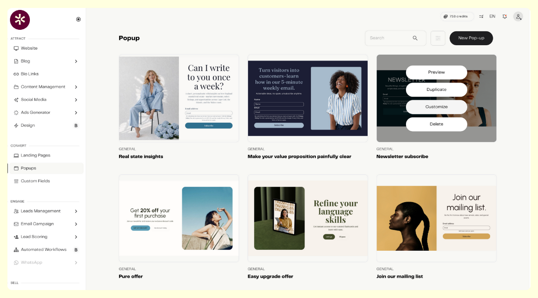
How to create a newsletter pop-up in Brandset
You don’t need a separate form plugin, a designer, and a developer. You can build and connect everything inside Brandset in a few minutes.
1. Create a new form
Go to Convert> Popup in your Brandset dashboard.
Click New Popup.
Choose the template:
Popup form (classic modal)
Inline (embedded in a page)
Full page (landing page style)
Floating bar (top or bottom banner)
and customize.
For newsletter growth, popups + floating bars usually do the heavy lifting.
Press enter or click to view image in full size
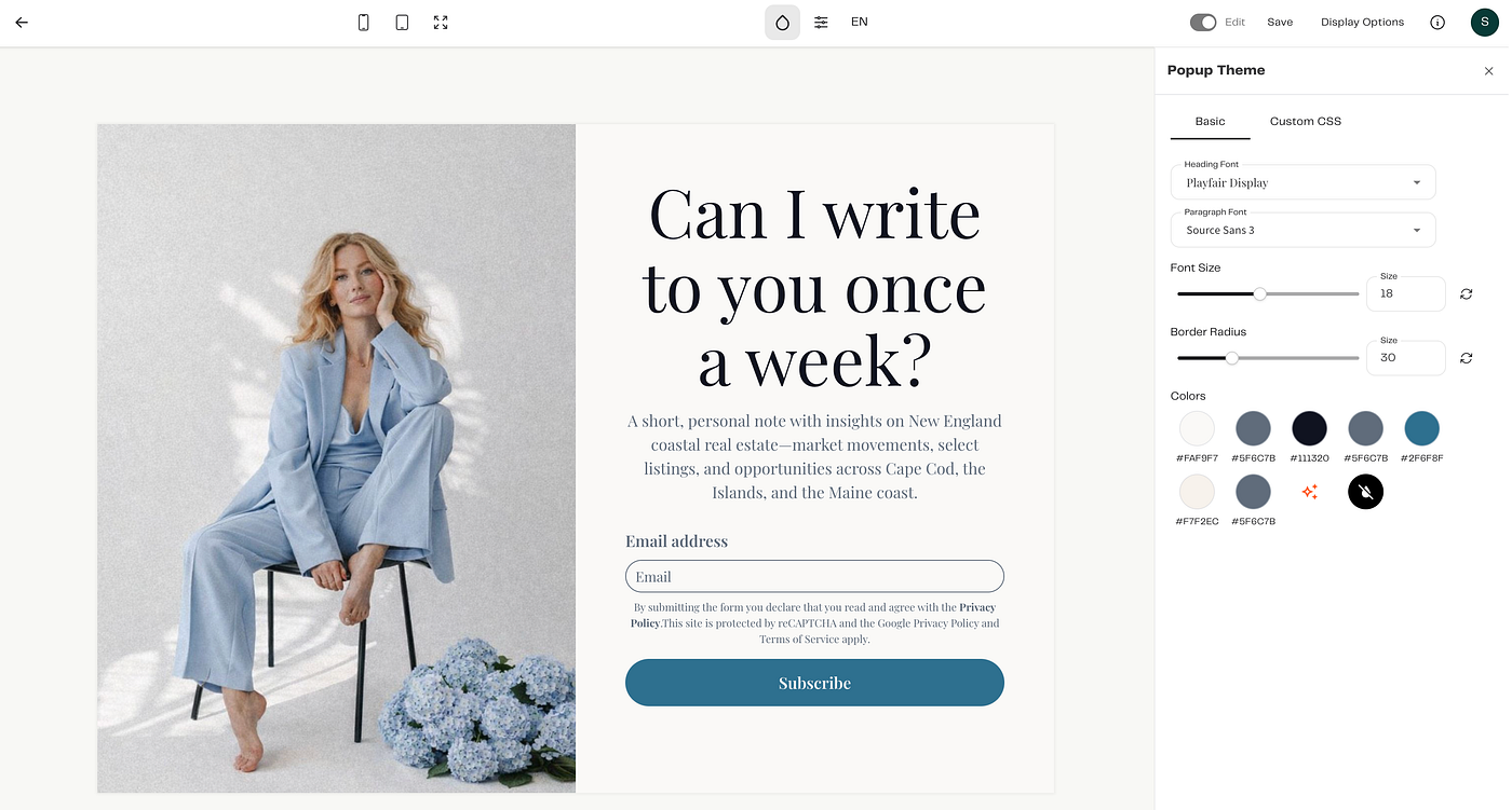
2. Customize the design to match your brand
Pick a starting template.
Apply your Brand Center settings: logo, colors, fonts.
Add a relevant image: upload your own, create with AI, or choose from your library/ stock
Then:
Edit the headline with a clear value prop
Add 1–2 lines of supporting copy
Set the form fields (start with email + optional first name)
Update the button text to something action-based (“Get the guide”, “Join the list”)
No code, no Canva export/import shuffle.
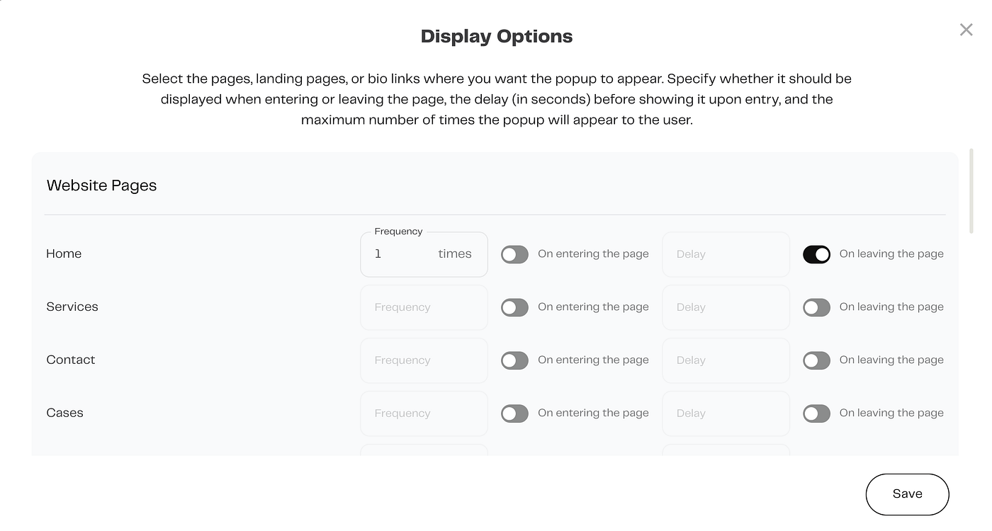
3. Choose when and where it appears
Inside the form settings, configure:
Trigger behavior:
on load
time delay
scroll depth
exit intent
Pages: all pages, only blog, only product pages, specific URLs (e.g., /resources, /pricing)
Keep it intentional: newsletter pop-up on content pages, discount pop-up on store pages, etc.
Press enter or click to view image in full size
4. Connect it to an automation
This is where Brandset becomes more than “just a form”.
Choose what happens when someone fills out your pop-up:
add to list / segment
start a welcome sequence
send discount code
deliver lead magnet
You can:
send an instant confirmation email (“Here’s your guide / code”), and
follow up with 2–4 short emails that build trust and gently invite them to take the next step.
Create pop-ups your audience actually likes
Pop-ups aren’t going anywhere. The difference between “ugh, close this” and “oh, nice” comes down to a few simple choices:
a clear, honest offer
thoughtful timing
on-brand visuals
a frictionless CTA
Brandset makes it easy to:
design on-brand pop-ups and full-page forms
connect them directly to automations, emails, and segments
manage everything in one place — site, forms, email, automations
So you can spend less time wiring things together and more time actually growing your list and revenue.