You know you should send a newsletter.
You’ve heard the advice a hundred times: “Build your list. Email your audience. Stay top-of-mind.”
And maybe you’ve even written a few drafts.
But then you stop cold — not because you don’t know what to say, but because you’re not sure how it should look.
You’re not alone. Even seasoned marketers freeze at the design step.
Formatting is one of the most overlooked parts of email marketing — and ironically one of the easiest places to lose your reader.
You can write a brilliant, thoughtful newsletter…
…but if the layout is cluttered, unreadable, or not mobile-friendly, your audience won’t get past the first sentence.
So let’s fix that.
Below is a clear, modern, Medium-level breakdown of how to format email newsletters that feel polished, intentional, and impossible to ignore.
Why formatting matters more than you think
Formatting isn’t decoration — it’s usability.
A strong newsletter format ensures your email is:
Readable (even in two seconds on a phone)
Professional (without feeling corporate)
Consistent (building brand trust)
Mobile-optimized (where ~80% of people open)
Aligned with audience preferences
Structurally sound for any niche
Think of formatting as the invisible force that makes your ideas land.
When formatting is done well, nobody notices it.
When formatting is done badly, it’s all people notice.
8 Practical newsletter formatting tips (That don’t require design skills)
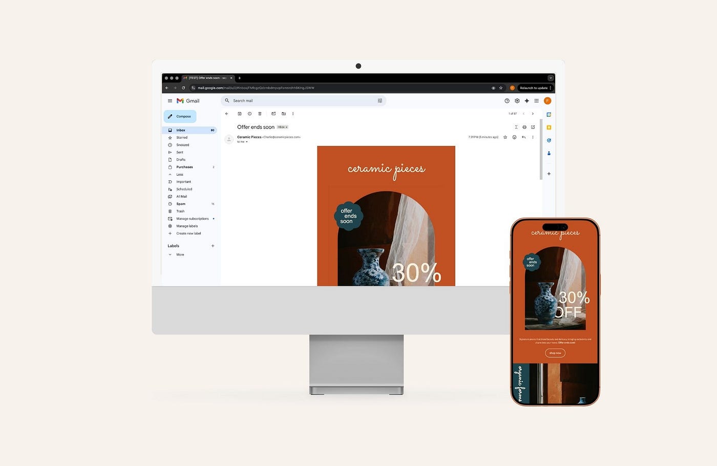
1. Optimize for mobile first
Most people check email while standing in line, scrolling before bed, or squeezing in a glance between tasks. If your layout breaks on mobile, you’ve already lost.
Design newsletters assuming the phone view is the main view.
That means:
Single-column layouts
Large text
Clickable buttons
Images that resize well
No tiny paragraph walls
Mobile-first isn’t optional — it’s survival.
Note: All Brandset email templates are automatically optimized for mobile. Layouts, typography, buttons, and images adapt seamlessly to any screen size — so your newsletters look polished and readable by default, without extra setup or adjustments.
Press enter or click to view image in full size
Press enter or click to view image in full size

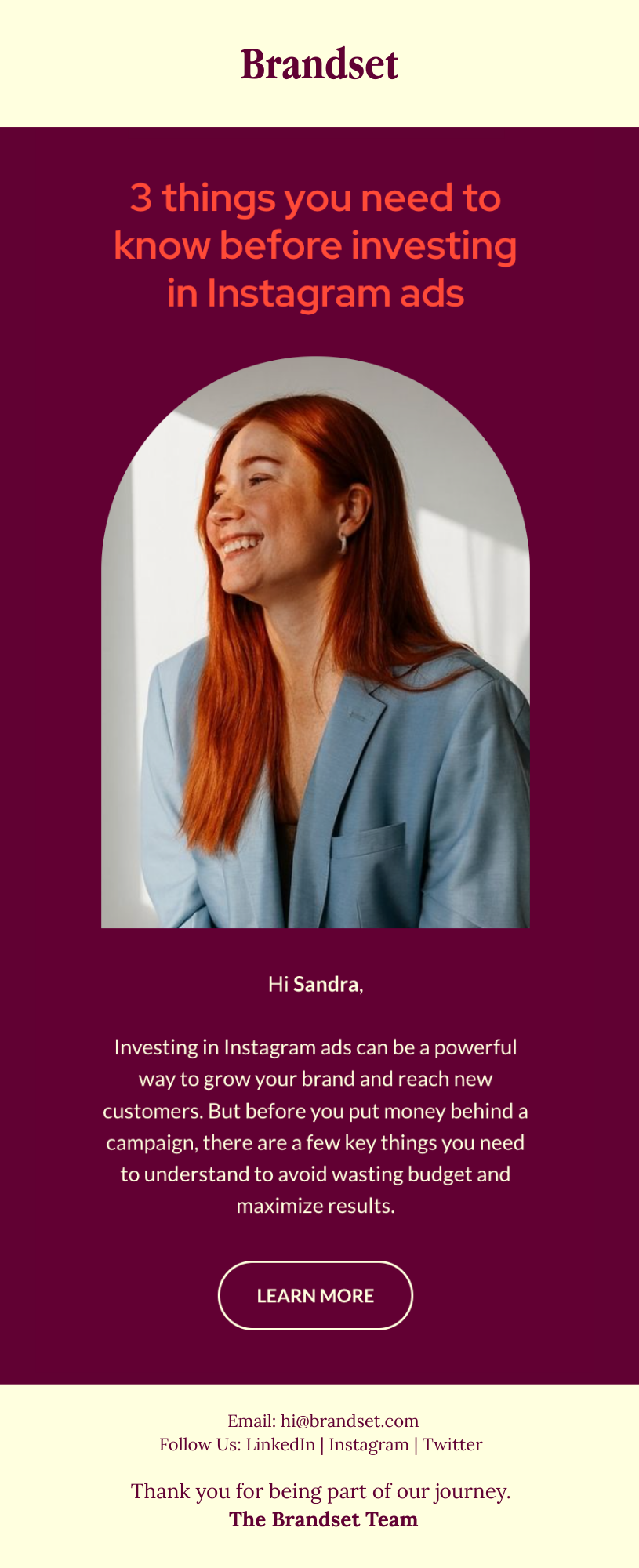
2. Use a branded header and footer
Your header and footer do more than decorate — they anchor your brand.
Your header can include:
Logo
Brand name
A simple tagline
Your footer should include:
Contact info
Social links
Legal information
A closing signature
These bookends make your email feel intentional and recognizable.
Press enter or click to view image in full size
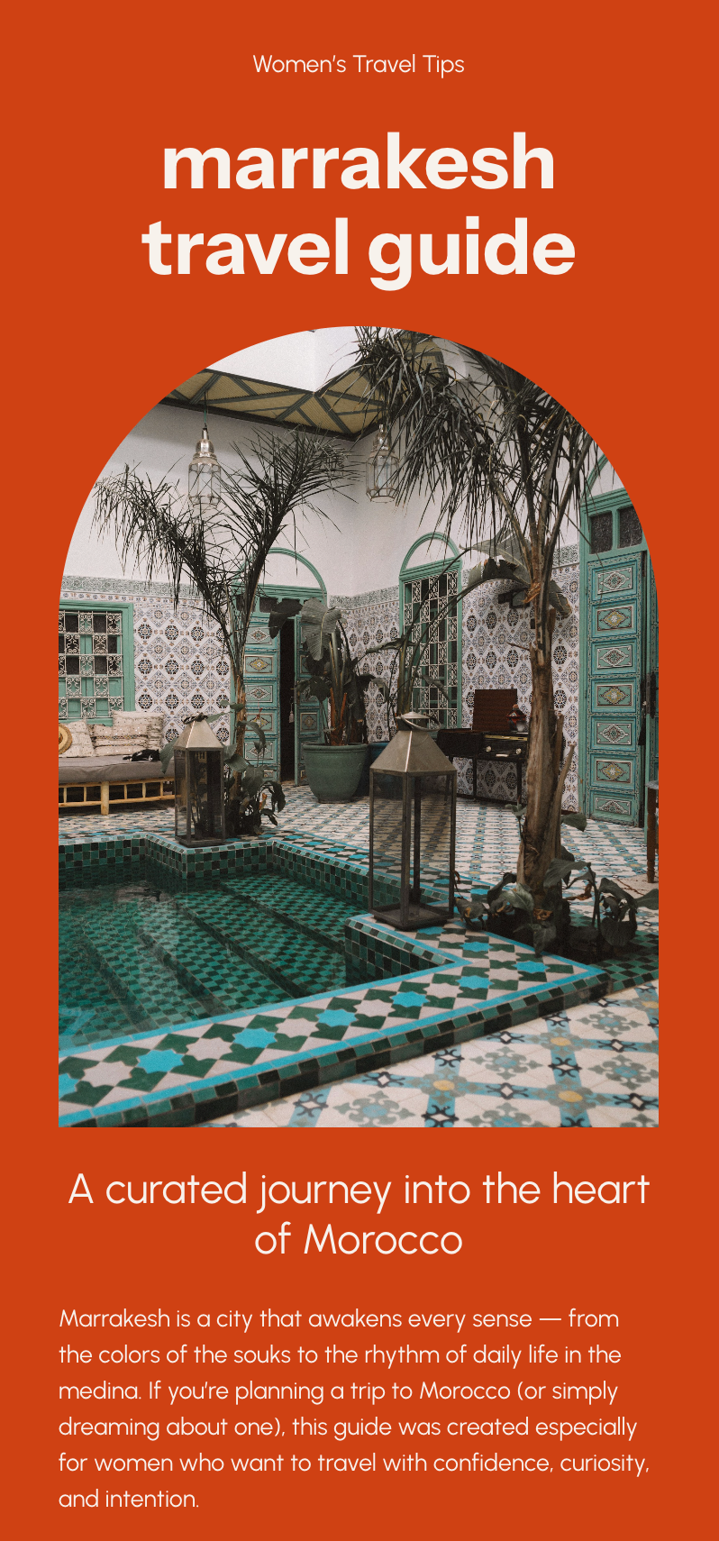
3. Design with your audience’s preferences in mind
Formatting isn’t one-size-fits-all.
Ask yourself:
Does my audience prefer minimalist layouts or bold visuals?
Do they respond better to short snippets or long storytelling?
Are they older (requiring larger fonts) or younger (open to GIFs, color, movement)?
The more you tailor the experience, the more engaging the newsletter becomes.
Press enter or click to view image in full size
4. Use visual hierarchy so readers know what matters
Readers skim.
Your job is to guide their eyes.
Use hierarchy:
Large text → high importance
Color contrast → draws attention
Spacing → creates breathing room
Repetition → builds cohesiveness
You’re not just designing — you’re choreographing attention.
Press enter or click to view image in full size
5. Balance text and images (ideally 50/50)
Images make emails scannable, but too many create noise.
Text carries meaning, but too much feels heavy.
Aim for a balance:
Use images to illustrate, not distract.
Keep text tight — every line must earn its place.
Don’t rely on images to convey essential information (some readers have images blocked).
Great newsletters feel light — even when they’re packed with value.
Press enter or click to view image in full size

6. Use fonts strategically (and sparingly)
You can be expressive… but not everywhere.
Use standard, email-safe fonts for body text (Arial, Georgia, Helvetica, etc.).
Save custom fonts for headers, accents, signatures.
Stick to two fonts max.
Prioritize readability over personality.
If your reader has to squint, you’ve already lost.
Press enter or click to view image in full size
7. Choose a tidy, minimalist layout with plenty of white space
White space isn’t “empty.”
It’s intentional breathing room that makes your content digestible.
Avoid:
Long walls of text
Heavy backgrounds behind large paragraphs
Overly decorative layouts
Clean design builds trust.
Busy design repels readers.
Press enter or click to view image in full size
8. Use (or create) templates to maintain consistency
Templates speed up your workflow and make your brand recognizable.
A strong template should include:
Your brand colors
Header + footer
Consistent spacing
Defined text sizes
Repeatable structures (hero section, body block, CTA)
Whether you use a pre-made template or construct your own inside your email platform, consistency is the easiest way to look “put together” every single time.
How formatting changes depending on the type of newsletter
Not all newsletters behave the same. Here’s how to adjust your layout based on the content you send.
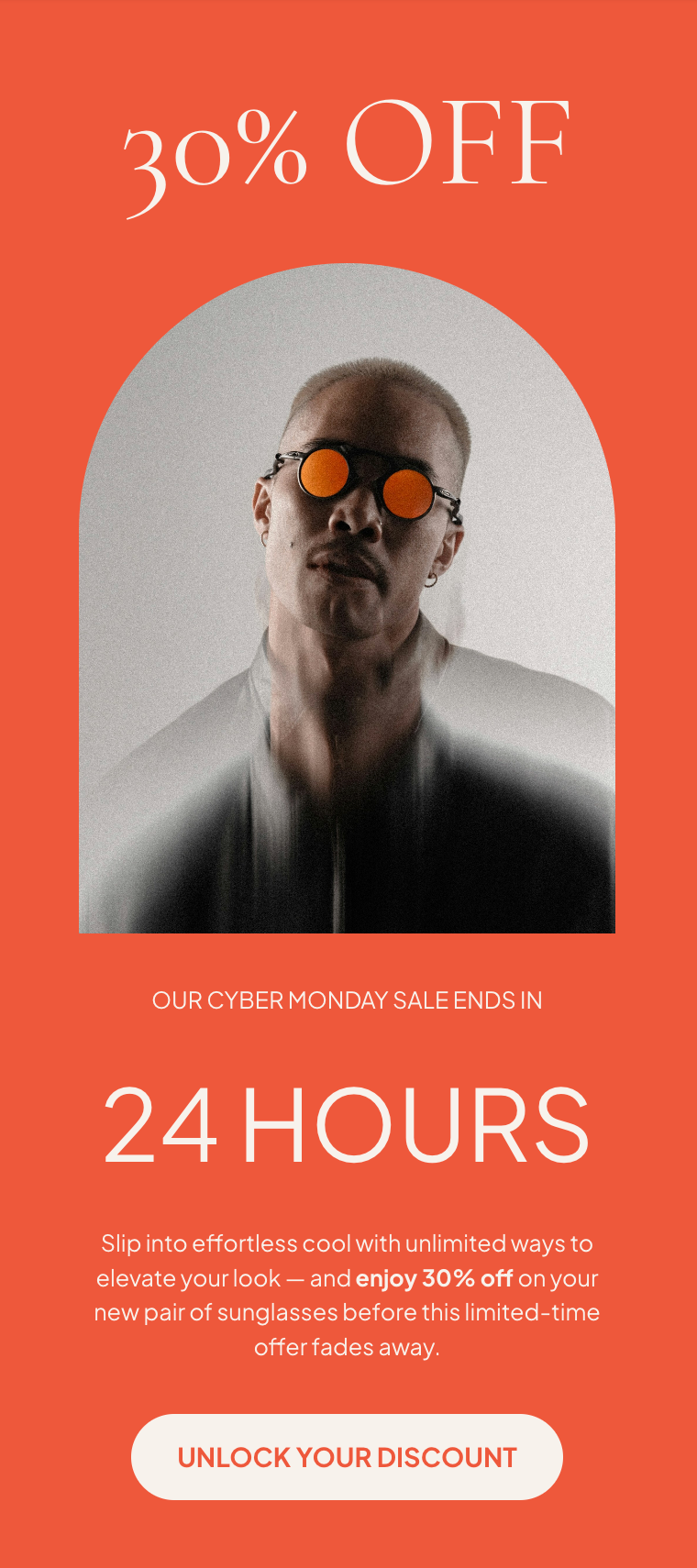
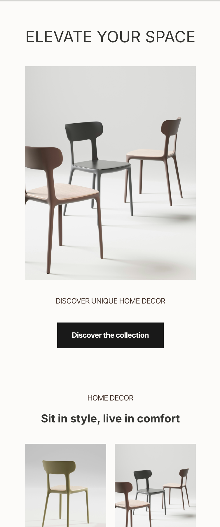
Ecommerce Newsletter
Focus: a product, offer, or promotion.
Formatting tips:
Eye-catching hero section with the product
One strong CTA (“Shop Now”)
High-quality product images
Minimal copy
Sense of urgency
Nonprofit Newsletter
Focus: updates, impact, donor relationships.
Formatting tips:
Clean, calm design
Emphasis on storytelling
Highlight impact metrics
Clear donation buttons
Minimalist color palette
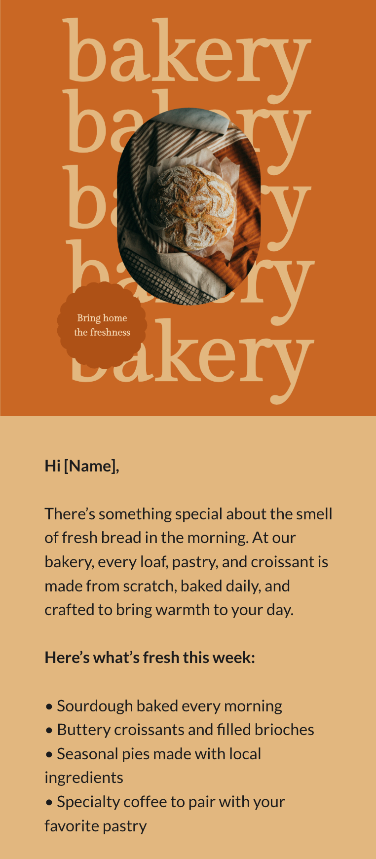
Blogger / Creator Newsletter
Focus: relationship-building.
Formatting tips:
Add personal elements (signature, photo, voicey intros)
Use headers that sound like you
Keep the design warm and human
Add buttons linking back to long-form content
Maintain consistency with your blog aesthetic
The newsletter format that works every time
Whether your audience is corporate or creative, young or experienced, B2B or DTC, this structure almost always works:
Branded header
Short, powerful opening sentence
Main section with visual hierarchy
Supporting section (optional)
Clear call-to-action (one main CTA)
Footer with brand details and links
Simple. Clean. Repeatable.
The bottom line
A well-formatted newsletter doesn’t call attention to itself — it lets your ideas shine.
If your content is excellent but your formatting is chaotic, your reader won’t stay long enough to recognize your value.
But when your layout is intentional, mobile-friendly, and aligned with your audience?
Your email becomes something rare:
A newsletter people actually look forward to opening.