You don’t need to be a designer to build a high-converting landing page.
You need to understand one thing:
people don’t “decide” to convert — they get guided into it.
A landing page works when it reduces uncertainty, removes friction, and makes the next step feel obvious.
Below is the landing page formula built on real human behavior — the shortcuts people rely on when they’re scanning fast and deciding faster.
1) Win the first 3 seconds (halo effect)
When your landing page looks clean and intentional, people assume the offer is credible.
That’s the halo effect:
if it looks premium, it feels trustworthy — before they read a word.
What to do:
keep the layout minimal
use strong hierarchy (headline → benefits → CTA)
use one strong visual, not five competing ones
remove visual noise (menus, extra links, clutter)
Your design isn’t decoration. It’s a trust signal.
2) Make it easy to understand (cognitive fluency)
Your visitor is not trying to be impressed.
They’re trying to understand:
What is this?
Is it for me?
What do I get?
What happens next?
If your copy is “clever” but unclear, it creates friction.
Friction kills conversions.
What to do:
write like a human, not a brochure
use plain language (no buzzwords)
make the headline benefit-first
use short sentences and skimmable sections
A simple test:
If someone can’t explain your offer in 5 seconds, your page is too complex.
Press enter or click to view image in full size
3) Remove uncertainty with social proof
When people aren’t sure, they look for signals that others already made the decision.
That’s why social proof converts:
it replaces “I don’t know” with “this seems safe.”
What to add:
testimonials with names and context
specific outcomes (“Saved 6 hours/week” beats “Amazing tool!”)
logos, mentions, ratings, or customer counts (only if true)
Best placement:
right next to the CTA.
Proof works best at the exact moment of hesitation.
4) Use urgency without sounding fake (loss aversion)
People are more motivated by the fear of losing than the chance of gaining.
But here’s the rule:
urgency only works when it’s believable.
Good urgency:
“Early access closes Friday”
“Next cohort starts in 6 weeks”
“Limited spots this month”
Bad urgency:
“Limited time offer!” (with no reason, no deadline, no context)
If urgency feels manufactured, it breaks trust.
And once trust breaks, conversion dies.
5) Make the CTA feel like a safe step (CTA psychology)
Your CTA button is not a button.
It’s the moment of commitment.
Two things matter most:
what the button says
how risky the action feels
Better CTA language:
“Start free trial”
“Get the template”
“Book a demo”
“Send me the guide”
Avoid:
“Submit”
“Click here”
generic actions with no reward
Add micro-reassurance near the CTA:
“No credit card required”
“Cancel anytime”
“Takes 30 seconds”
You’re not “pushing.”
You’re reducing uncertainty.
6) Build trust like a checklist (risk reduction)
Most people don’t convert because of risk:
“Will I be charged?”
“Will I get spammed?”
“Is this legit?”
“Can I cancel?”
If you don’t answer those questions, they assume the worst.
Trust signals that work:
clear pricing (or clear “free trial” terms)
privacy reassurance (“We never share your email”)
short FAQ section (“Do I need a card?” / “Can I cancel?”)
real-world proof (reviews, testimonials, transparent claims)
Trust isn’t a slogan.
It’s clarity + transparency.
The landing page formula in one line
A landing page converts when it does three things:
clarifies the offer
reduces friction
removes risk
Design trends don’t convert.
Psychology does.
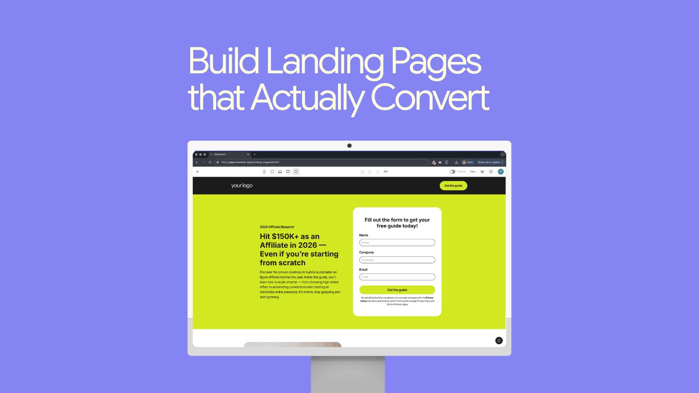
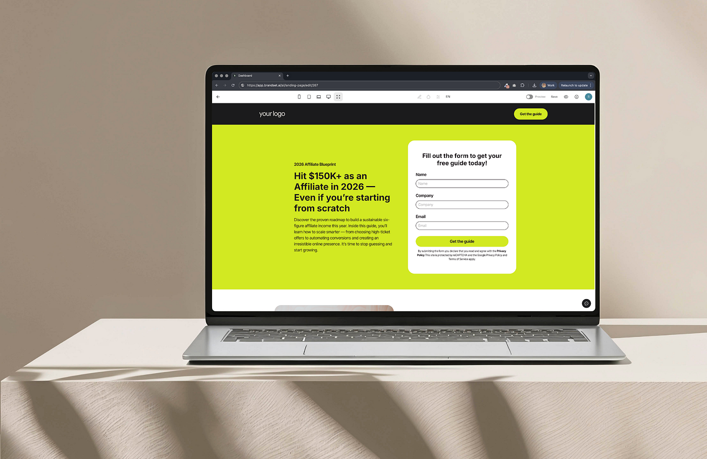
Want to build landing pages without overthinking?
Brandset was built for small teams that want pages that convert — without juggling tools, designers, or complicated setup.
Create landing pages, capture leads, and trigger follow-ups automatically — all in one place.
Claim your 14-day trial and build your first converting page today: www.trybrandset.com