Pop-ups still work ridiculously well when they’re thoughtful, on-brand, and timed right. In this guide, you’ll see 9 types of website pop-ups you can use to grow your email list, offer discounts, and keep people from leaving your site empty-handed—plus how to build them inside Brandset.
What is a website pop-up?
A website pop-up is a small window that appears “on top” of your page to highlight something important:
join your email list
grab a discount
download a freebie
finish a purchase
sign up for a webinar
Because pop-ups interrupt the scroll (even gently), they’re still one of the highest-converting ways to:
collect emails
promote offers
save abandoned revenue
Used badly, they feel like a desperate salesperson.
Used well, they feel like “oh nice, that’s exactly what I needed.”
Common types of pop-ups
You can mix and match these behaviors inside Brandset depending on the goal:
Timed pop-up: Shows after someone has been on the page for X seconds. Good when you want to give them a moment before making an ask.
Scroll-triggered pop-up: Appears after they’ve scrolled, say, 40–60% of the page. Great for blog posts and long sales pages.
Entry pop-up: Fires right when they land (or on first pageview). Use sparingly and make the value very obvious.
Exit-intent pop-up: Detects when someone’s about to close the tab or hit back and gives them one last, relevant offer.
Floating bar: A slim bar at the top or bottom of the screen. It stays visible as they browse without blocking the page.
Full-screen welcome mat: Covers the whole viewport with a bold message. Works for big events, launches, or your main lead magnet.
Why pop-ups still work
Opt-in pop-ups consistently outperform:
sidebar forms
footer forms
“generic” end-of-post CTAs
Because they:
grab attention at the exact right time
match the context of what the visitor is doing
make it easy to say “yes” with one field and one button
In practice, even a simple pop-up can add 1–8% conversion on a page that previously did almost nothing for list building or offers.
Let’s walk through 9 examples you can steal (and adapt) for your own Brandset site.
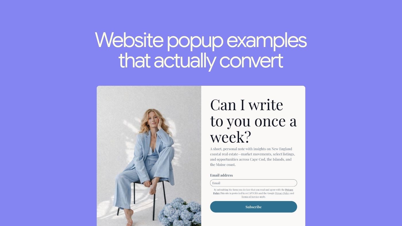
1. Newsletter opt-in pop-up
Goal: Grow your email list with people who want to hear from you regularly.
Why it works
A good newsletter pop-up:
looks like your brand (not a generic modal)
offers a clear, specific reason to subscribe
doesn’t ask for a ton of info (start with email + maybe first name)
Example pattern
A home decor creator might use:
“Get the weekly edit – the best decor finds, before they sell out.”
The pop-up shows:
a styled interior photo that matches their vibe
one sentence about what subscribers get
a simple field + button: “Get the weekly edit”
Brandset tip: Use a scroll-triggered pop-up on blog posts and an exit-intent pop-up on your home + product pages with the same core offer and design, so the experience feels cohesive.
2. “Be the first to know” shop update pop-up
Goal: Build a list of buyers who care about drops, restocks, and launches.
Instead of a generic “join our list,” make it about early access.
“Be the first to know about new arrivals every Friday morning.”
Why this works:
tells them what they’ll get (product updates)
tells them when they’ll get it (Friday mornings)
positions it as “inner circle,” not random spam
You can put this in a small, bottom-corner pop-up that:
doesn’t aggressively block the page
stays visible while they browse
can be closed if they’re not interested
Brandset tip: Connect this form to a segment like “Product update interests” and trigger a simple weekly digest email using Brandset automations.
3. Lead magnet pop-up (“get the guide/checklist”)
Goal: Offer something concrete in exchange for an email: guide, template, checklist, mini-course.
Instead of vague “exclusive content,” make it tangible:
“Get the Petite Style Guide + Capsule Wardrobe Checklist – free for newsletter subscribers.”
Why this works:
the freebie is clearly named and specific
it’s obviously valuable to the right person
“just for subscribers” makes it feel like a perk, not a trick
Brandset tip:
Use a full-screen welcome mat on your main content hub (blog / resources) with your best lead magnet.
Trigger an instant delivery email via automation so the freebie link arrives in their inbox immediately.
4. First-order discount pop-up
Goal: Turn new visitors into first-time buyers.
Classic, but still effective when done cleanly.
“Get 15% off your first order
Join our list for early access to drops, styling tips, and more.”
Why this works:
the discount is front and center
the copy is short and clear
it tells them what else they get beyond the code
You can trigger this:
as a timed pop-up after 10–20 seconds, or
at exit intent on key product pages
Brandset tip: Use a single discount welcome flow for all first-order pop-ups. Tag these subscribers as “Welcome offer claimed” so you don’t keep showing them the same offer later.
5. Timed discount + preference pop-up
Goal: Offer a smaller discount and collect preference data at the same time.
Example:
“Take 10% off your first order
Tell us what you love so we can send you the good stuff.”
Fields:
email
“What do you prefer?” – [Chunky pieces] [Dainty pieces] [Both]
Why this works:
the offer is still attractive
the extra field feels useful, not intrusive
you get immediate segmentation for more relevant emails later
Brandset tip:
Map the preference options to tags in Brandset (e.g., pref_chunky, pref_dainty).
Use these tags to send future campaigns: “New dainty pieces you’ll love,” etc.
6. Welcome pop-up with “starter kit”
Goal: Turn first-time visitors into subscribers with a bundle of perks.
This is more than “get 10% off.” Think of it as a tiny onboarding.
Example:
“Welcome inside.
Get your starter kit:
– monthly digital goodie
– behind-the-scenes notes
– 15% off your first order”
Why it works:
feels like joining a world, not just a list
combines content + discount (not just money off)
sets expectations (“1–2 emails per month, no spam”)
Brandset tip: Use a branded illustration / photo that shows your aesthetic. In the confirmation email, restate what they’ll get and how often to reduce unsubscribes later.
7. Exit-intent “wait, before you go” pop-up
Goal: Capture value before someone leaves:
email address, or
a first order they were on the fence about
Example:
“Leaving already?
Take 10% off your order if you complete it today.
Enter your email and we’ll send the code instantly.”
Why it works:
triggers only when they’re about to bounce
gives a compelling reason to stay
still feels optional (“No thanks” link)
You can also use exit-intent pop-ups to:
offer a “save your cart” reminder via email
invite them to get a guide instead of leaving with nothing
Brandset tip: Create a specific exit-intent pop-up for product pages (discount/save cart) and another for blog pages (freebie / guide) so the context matches what they were doing.
8. Floating bar for launches and free shipping
Goal: Keep a key message visible at all times without interrupting.
Use a floating bar to:
announce free shipping thresholds
highlight a new collection
promote a limited-time sale
Example: “New: Fall Collection ’24 is live – free US shipping over $75. [Shop now]”
Why it works:
always visible, rarely annoying
one clean line, one simple CTA
great for mobile (doesn’t block the whole screen)
Brandset tip: Use different floating bars on different pages:
Home / collection pages: new drop + free shipping
Blog: “Get the weekly newsletter” with a small inline form or link to a full pop-up
9. “Don’t leave empty-handed” exit pop-up
Goal: Give people one last way to stay in your world, even if they’re not ready to buy.
Example:
“Before you go…
Turn your space into an indoor oasis
Get our ‘Room-by-Room Plant Guide’ + 10% off your first plant order.”
Why this works:
the headline speaks to a desired identity (“indoor oasis”)
they get both a resource and a discount
it makes leaving without entering an email feel like missing out on something genuinely useful
Brandset tip: Pair this with an automated email sequence:
Deliver the guide
Share styling tips / setup inspiration
Gently remind them to use the discount before it expires
How to design pop-ups that people actually like (and use Brandset to do it fast)
A few principles that apply to every pop-up you create:
Make the value obvious in one glance: “Get 15% off” / “Weekly decor edit” / “Free checklist to X” – no guessing.
Keep the form short: Start with email only. Add one extra field only when it clearly improves personalization.
Match your brand: Colors, fonts, images – it should feel like your site, not a random widget.
Trigger at the right time:
don’t slam people with a giant modal the second the page loads (unless it’s a full campaign moment)
use time, scroll depth, or exit intent to keep the experience respectful
Don’t over-show: Respect people who’ve already subscribed / closed the pop-up. Use cookies / subscriber logic to avoid spamming them.
Doing all this inside Brandset
With Brandset, you don’t need 3 different tools (form builder + email platform + site builder):
Build pop-ups and full-page forms using your brand center (colors, fonts, logo are already there).
Choose triggers (on load, time delay, scroll, exit intent, floating bar).
Link directly to automations – welcome sequences, discount delivery, nurture flows.
Segment by behavior (which pop-up they used, what they selected) so future campaigns feel personalized, not generic.
Start your 14-fay free trial: www.trybrandset.com