When it comes to getting subscribers to actually read your emails (and click, and buy, and reply), design does a lot of the heavy lifting.
Your subscribers are getting dozens of emails every day. The average time spent reading a brand email is often cited around 10 seconds. Exact numbers vary by source and year, but the behavior is consistent: people scan fast and decide quickly.
In that window, your design has to:
Stand out in a crowded inbox
Be instantly readable on mobile
Make it obvious what to do next
In this guide, we’ll go through 17 practical email design best practices for 2026, with examples and tips you can apply no matter which email platform you use.
1. Start with a sender name people recognize and trust
Before people even see your subject line or design, they see your “From” name.
Many email studies consistently show that the sender name is one of the main factors people use to decide whether to open an email. The exact percentage changes year to year, but the pattern doesn’t.
If your name looks unfamiliar, generic, or automated, you’ve already lost people.
Good patterns (real inbox examples):
Sarah — Willow Studio
Mike from Riverside Auto
Emily | North Shore Pilates
Jason — Oak & Pine Design
Trends & CO Weekly
Tips:
If you’re using a personal name, anchor it to the business.
Be consistent — don’t keep changing “From” names.
Never use no-reply@…. It feels cold and discourages replies.
2. Write subject lines that earn the open
Your subject line is your first design decision. If nobody opens, the rest doesn’t matter.
Strong subject lines are:
Short (ideally 6–10 words)
Clear over clever
Specific about value
Aligned with what’s inside
Examples you actually see from small businesses:
A small update on how we’re working
I changed how I send proposals
New arrivals are in
Holiday hours for this week
Tips:
Front-load key words (they get cut off on mobile).
Use power words sparingly: new, next, mistakes, behind the scenes.
A light emoji can help if it fits your brand tone.
3. Use preview text as a second subject line
Preview text is the gray snippet next to or under the subject line. Think of it as a second subject line.
Bad:
Leaving it as “View this email in your browser…”
Better:
Using it to complete the subject.
Example:
Subject: Your welcome sequence is doing too much
Preview: Here’s how to fix it in 3 emails
Tips:
Summarize the main benefit or hook.
Create urgency when relevant (without hype).
Don’t repeat the subject line word for word.
Keep it under ~90 characters.
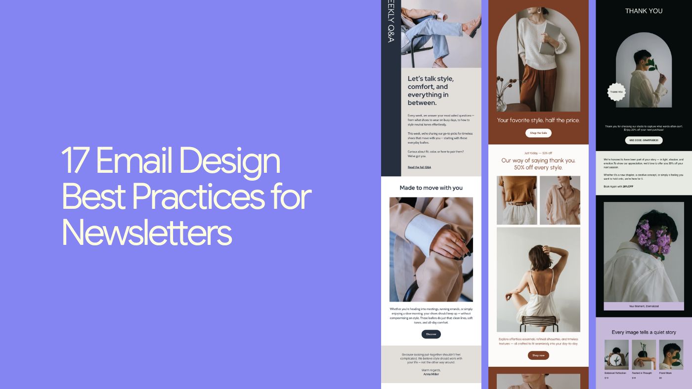
4. Design once: use a flexible, reusable email template
A well-designed template:
Gives you a clean, consistent base
Solves layout issues (spacing, responsiveness)
Makes it easier to stay on-brand
You can use:
Built-in templates from your platform (including tools like Brandset)
A simple “master layout” you reuse and tweak
Tips:
Design the structure once, then clone.
Pick templates that match your goal: product updates ≠ long-form editorial.
Remove blocks you don’t need — don’t fill space just because it’s there.
5. Design mobile-first (because that’s where emails are read)
In 2026, designing email desktop-first is like designing TikToks for TV.
Most people read newsletters on their phones. If your email breaks on mobile, it gets deleted in seconds.
Mobile-friendly basics:
Single-column layout whenever possible
Big, tappable buttons (at least ~44×44 px)
14–16px minimum body text
Generous line-height (1.4–1.6)
Tips:
Always preview on mobile before sending.
Avoid tiny links buried in small text.
Add alt text to images.
Compress images so emails load fast, even on shaky connections.
6. Hook readers with a clear, focused header
Once they open, your header is the first visual impression.
Good headers usually include:
Logo or wordmark
Strong, clear headline
Optional short subheading for context
Example structure:
Logo at top center or left
Headline: A quick update from us
Subhead: What’s changed and what hasn’t
Tips:
Keep header height reasonable.
Use consistent header styles across sends.
Make sure the headline communicates value fast.
7. Guide the eye with a strong visual hierarchy
Visual hierarchy is how you guide the reader through the email.
Done well, someone skimming should still understand:
What this is about
Why it matters
What to do next
Common patterns:
Inverted pyramid (headline → support → CTA)
Z-pattern (mixed text and visuals)
F-pattern (text-heavy emails)
Hierarchy tools:
Font size and weight
Color (especially for CTAs)
Spacing (more space = more importance)
8. Let your design breathe with intentional white space
White space is breathing room.
Cramming everything together feels stressful and cheap. Space creates:
Focus
A calmer, more premium feel
Better readability on mobile
Tips:
Add padding above and below key sections.
Break long emails into clear blocks.
“White” space doesn’t have to be white — it’s about emptiness.
9. Use images to support the message, not distract from it
Images carry emotion and context faster than text.
Good email visuals:
Support the message (not random decoration)
Match your brand style
Load quickly and look good on retina screens
Tips:
Use real product photos, screenshots, or workspace images.
Keep file sizes small.
Don’t rely on images for critical information.
Always add descriptive alt text.
Avoid image-only emails.
10. Use video when it adds clarity or momentum
Not every email needs video, but when it helps, it really helps.
Video can:
Increase click-throughs
Reduce confusion
Humanize your brand
Since most email clients don’t autoplay video:
Use a thumbnail with a play button
Link to a landing page or video host
Tips:
Mention video in the subject or preview text.
Add captions — many people watch muted.
Include the length to set expectations.
11. Stick to readable, widely supported fonts
Fonts are both design and UX.
Unreadable or unsupported fonts make emails look broken.
Stick to:
Web-safe system fonts for body text
Custom fonts sparingly (headlines or images)
Tips:
Use no more than two font families.
Body text around 14–16px.
Avoid long, centered paragraphs.
Break text into short paragraphs and bullets.
12. Design with your audience and segments in mind
Design isn’t just visuals — it’s relevance.
Simple personalization can go a long way:
Using a first name where it feels natural
Referencing a recent action
Showing content that matches interests
Tips:
Avoid robotic merge tags everywhere.
Segment by behavior when possible.
Keep your tone human and consistent.
13. Make your primary call to action impossible to miss
Design exists to lead people to an action. Your CTA can’t be a tiny link buried at the bottom.
Good CTAs are:
Visually obvious (contrast, size, spacing)
Clear (“View the details”, “Check availability”, “Reply with a question”)
Singular — one primary action per email
Examples that work in real emails:
See the details
Check availability
View the menu
Reply with a question
Start here
Tips:
First-person CTAs often perform better.
Place one CTA above the fold and another near the end.
Make it easy to tap on mobile.
14. Turn your footer into a helpful, on-brand close
Footers aren’t just legal boxes.
They can include:
A short reminder of who you are
Why the person is receiving the email
Links to manage preferences or unsubscribe
Tip:
Keep it clean, readable, and consistent with the rest of the email.
15. Make unsubscribing easy
This isn’t just legal — it’s good UX.
If people can’t find the unsubscribe link, they’ll:
Mark you as spam
Hurt your deliverability
Remember you negatively
Best practices:
Clear unsubscribe link in the footer.
Optional “manage preferences” link.
Neutral, respectful language.
16. On-brand beats on-trend, every time
Consistent branding builds trust.
Consistency looks like:
Same logo placement
Similar colors and typography
Familiar layout patterns
Recognizable tone of voice
Over time, people recognize your emails before reading the sender name.
17. Always test before you hit send
This is the step most people skip.
Testing catches:
Broken links
Typos and wrong names
Mobile issues
Image or dark-mode problems
What to test:
Subject and preview text
Mobile and desktop layout
All links and buttons
Personalization tags
Even small fixes compound over time.
Key takeaways for great email & newsletter design
Start in the inbox: trusted sender name, clear subject, strong preview text
Design mobile-first with readability and speed in mind
Guide the eye with hierarchy and white space
Stay consistent and on-brand
Respect the reader with clarity and choice
Tools can help with templates and responsiveness — but taste, clarity, and restraint are still human decisions.
Get those right, and your emails stop feeling like noise and start feeling like something people actually look forward to.